Thursday, August 25, 2011

"Be well, do good work, and keep in touch."

By Maureen Mulhern, Caggio Blog Contributor
August 2011 • Milwaukee, Wisconsin


For those of you who are friends of Caggio-- an art experiment turned community gallery, run by proprietors Joseph Ledger and Kaitlin Rathkamp-- the news of the gallery's closing earlier this month was indeed bittersweet for Milwaukee's East Side. All good things must come to an end, but my connection with Caggio has been more than that of Blog Contributor, and I am sad to see to see it go. For the last year I had the opportunity to interview many of Wisconsin's emerging and established fine artists. I am grateful for my monthly assignments, especially through the winter months. I had the chance to visit artist studios and conduct interviews and see the work and process up close, gaining an in-depth perspective. With that said, I thank Joseph and Kaitlin for the opportunity to partner on this project. I'd also like to thank the many artists I had the pleasure of meeting and interviewing: Jim Finnerty, Daniel David Kaiser, Mark Johnson, Brent Oudejans, William Lemke, Charles Dwyer, Stephanie Barenz, Kayla Koeune, Tim Nyberg, Chad Hallblade, and Guy C. Landgraf Jr. Last but not least, I'd like to thank Dax Odom for introducing me to Caggio.


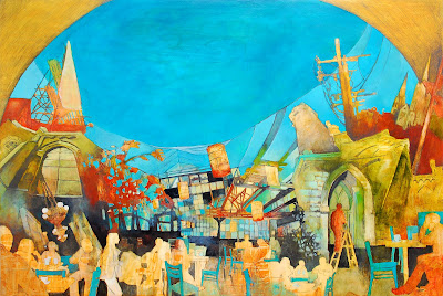
For Caggio's finale last month, Stephanie Barenz was featured artist. Barenz has continually exhibited at Caggio; from the day the doors opened-- poignantly-- to the day the doors closed. Her new work is rooted in Milwaukee's identity as a Midwestern city-- architecturally captivating, gritty, historical-- born out of industry. I had the chance to interview her yet again [my first interview was six months ago] to learn more about her new series of paintings City Middle. I also toured Wisconsin Avenue with her-- inspirational for the new work-- rich in architectural elements. We visited the old brick Coakley Brothers building and Clock Tower [with surrounding industrial buildings], Our Savior's Lutheran, Tripoli Shrine Center, Ambassador Hotel, Neo-Renaissance styled Milwaukee Public Library, St. James Episcopal and Church of the Gesu [the most striking Gothic cathedral with it's iconic rose window]. It was great to be on foot exploring Milwaukee, truly a City of Steeples.

As Barenz prepares to spend a year abroad in China; as Caggio closes it's doors; it seems change-- big change-- is in the air.

Barenz exhibited her new series City Middle at Caggio during July and August. Wisconsin in peak summer is hot, humid, lush with greenery-- and stormy. The day I interviewed her, we sat in the sun-soaked gallery and discussed her new work. Exploring place continues to be integral, as does opposing spacial perspectives and dreamlike imagery. I was curious to learn the motivation for such specific locals in her new work, the evolution of her techniques and processes, and her life now as professor and artist. What I learned is, to Barenz, place is everything. What I also learned is that to create the most compelling work there needs to be a certain level of uncertainty. One of Barenz's favorite quotes is by Philip Guston, "When you're in the studio painting, there are a lot of people in there with you-- your teachers, friends, painters from history, critics-- and one by one if you're really painting, they walk out. And if you're really painting YOU walk out."


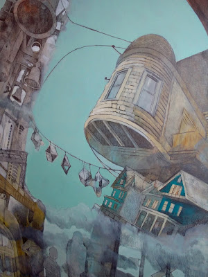
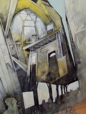
Wisconsin and North Avenues provide a backdrop for imagery in Barenz's new work. Three components show up time and time again in her work: telephone poles, row housing, and church steeples. To anyone who is familiar with Milwaukee's surrounding neighborhoods, it is not hard to imagine its bygone past. Vintage brick industrial buildings, bridges, water towers and smokestacks abound with vestiges of old signage; telephone poles with miles of cables connect linear landscapes; churches on almost every corner boast steeples dotting skylines; and tree lined streets frame quaint row housing. Interestingly, the artist chose these two main thoroughfares in Milwaukee to explore, as she started to investigate alternative routes during freeway construction this year. Surprisingly, she found an immense amount of material to inspire her work-- and thus took to photographing and exploring on foot. Steeples-- iconic to the many churches in this part of the country-- hold significance for Barenz, the daughter of a minister. For her, the church is a positive experience-- an important lifelong Third Place-- and therefore central to imagery in her work. The Third Place in this context is a place that is warm and glowing, consisting of both memories and existing in real time. It is an environment of visceral emotions. Within this narrative the artist explores her own sense of place, developing the idea of home, bringing to the forefront not only figures-- anonymous and familiar-- but the idea of moving between locations. Furthermore, churches in the Midwest are living symbols of art and architecture, historical markers that continually intrigue the artist as she is a self described architecture lover. Oftentimes in economically depressed neighborhoods, they provide outreach and hope, which is yet another important aspect to the artist's investigation into place-- as well as the "sanctity of knowing one's neighbor, the importance of locality and the elevation of the commonplace to the remarkable."*


As Barenz evolves her techniques and process, there is a recurring theme in the new work. That is repetition: Repetition of place, form, structure and palette. She also uses cloud cover to create tension; to be the active element that shows potential for change. Her meticulously tried-and-true process has taken years to perfect. Taking hundreds of pictures-- documenting the world around her-- Barenz starts a composition with photographic imagery that intrigues her. The artist prefers navigating her surroundings on foot, experiencing the environment in infinite detail, as only interaction in this proximity can provide. In terms of technique, the painting begins to take form only after the initial idea is chosen. Each painting has a spontaneous start: the artist throws Sumi Ink and acrylic paint down on a wood panel indiscriminately and lets the paint drip. The composition is entirely abstract in this phase. Next, the artist chooses several images, lays them out on the surface, shifting and rearranging until a focal point comes forth. Oftentimes the focal point is a sort of portal: an arch, alley or doorway. Only then does she begin sketching, using a combination of drawing, drafting, and painting. Vignettes emerge of urban landscapes-- juxtaposed and collaged like short stories-- architecture, trees, interior rooms, neighborhoods, and figures at rest or in motion. A narrative presents itself, captured unselfconsciously in a moment in time. Pushing her process further, she has recently partnered with Design Fugitives and had her images carved on large wood panels with a CNC Milling Machine. Although the finishing work on wood panels is quite labor intensive, this new direction opens up endless multi-dimensional possibilities. Collaborations with key artistic partners are gaining importance; whether it be with an architect to produce wood panels; or with a musician to explore how paintings influence song-writing and composition. Local talents Tuan N. Tran and Matthew Robert Eich provide integral partnerships as her work evolves.


Barenz leaves the US shortly to teach at Hangzhou Dianzi University in China. As artist and professor, she is indeed venturing into a new and exciting chapter. It is such a fitting move for the artist, venturing to a new place with it's own close-knit communities-- presenting a whole new language of symbols, relationships, locations, history and architecture-- with dreamlike parallels to the familiar but existing in real time. As Milwaukee represents a city that is becoming-- evolving-- but retaining its roots; may Hangzhou be an amazingly inspiring counterpart. Place is everything.

With gratitude,
Maureen

*title quote by Garrison Keillor
*quote from Stephanie Barenz bio

painting titles [in order]

City of Steeples

The Ma Bells of Milwaukee
Out of the Fire
The Ambassador
Sign on North
*all images copyright Stephanie Barenz

photo location [in order]
Coakley Bros. Clock Tower
Industrial area near Coakley Building
Utility poles near Coakley Building
Our Savior's Lutheran
Tripoli Shrine Center
Ambassador Hotel
Milwaukee Public Library
St. James Episcopal
Church of the Gesu Rose Window
Church of the Gesu
*photos taken on Wisconsin Ave. by Maureen Mulhern

Friday, April 29, 2011

Spotlight on Chad Hallblade and Guy C. Landgraf Jr.

By Maureen Mulhern, Caggio Blog Contributor
April 2011 • Milwaukee, Wisconsin


This month's Q+A highlights photographer Chad Hallblade and painter Guy C. Landgraf Jr., exhibiting artists at Caggio for April/May. The show opens toda
y (April 29th - May 30th), featuring Hallblade's Milwaukee-based photography and Landgraf's abstract works on paper. In this conversation, I gained insight into each artist's distinct personality, creative process and artistic pursuits. Premiering tonight at Caggio.

Q: What is the theme behind this body of work?


Chad: Like much of my work, the images were shot in industrial settings. I usually shoot in these areas when no one’s around and I can take my time a
nd make thoughtful photographs. Most of my images are composed to deny linear perspective, focusing instead on shapes and planes. This way of shooting has the effect of flattening out the picture.

Guy: The theme would be about looking and being in the moment of the work.


Q: Talk a little about your connection to or feelings about Milwaukee; How does location influence your work?


Chad: Most of my work is shot in Milwaukee, but it isn’t really about the city. I guess that I borrow from the city to make art. I grab bits a
nd pieces, details of the city to make photographs.

Guy: Milwaukee is a great place to work and create. It has a good developing art community. I believe location has a strong influence on an individual’s work. What they see day today, or what they pay attention to, it all goes into the work somehow. It does for me anyhow.

Q: What is the significance of your chosen subject matter?


Chad: There may be no significance other than it’s
what I like to look at. I choose my subject matter for it’s color, tonal qualities, and variety of shapes.

Guy: It’s inherent in the objectness of the work. It’s an abstraction from something tangible, real, or maybe once seen or reminded of.


Q: How do you create balance between marketing your work vs
. the day-to-day process of creating art?

Chad: I have very little time for it. [
Marketing] I more or less just pick my spots for showing. As far as making art or shooting photos, I’m not one of those people who constantly has a camera in hand. I shoot fairly often, but not necessarily with the intention of making art. When I feel like I’ve got some thoughts lined up that might lead me to making strong photographs, then I grab my old film camera and tripod and head out the door.

Guy: It’s a tight rope. You just do it or you don’t.


G. Landgraf

Q: Which artists influence you and who do you admire?

Chad: I like Modernist abstract painting, from Cubism to Abstract Expressionism. I think about [Piet] Mondrian quite a bit with his geometric compositions, Richard Diebenkorn was always a favorite, as well as [Willem] de Kooning. As far as photographers, Lee Friedlander was a big influence on me when I first started shooting. His wa
y of photographing walked the line between representation and abstraction. He was the first photographer I saw that really worked that way. I still really enjoy looking at his work. I spend a good deal of time looking at photography on the internet. There are a number of excellent blogs out there, highlighting contemporary fine art photography.

Guy: It’s easy to enjoy all art history, but painter’s like: Newman, Rothko, Duchamp, Giacometti, Marden, Twombly have always struck a chord. Recently, I’ve been interested in Japanese painting.


Q: What two words would you use to describe your point of view?


Chad: Flat and subtle.


Guy: I’m making something with a visual language. But a viewers point of view may be that of stepping outside of a place or thing and noticing that thing.

C. Hallblade

Q: Is there a particular piece in this body of work that you feel best defines your overarching theme?

Chad: I think that the Untitled photograph of the wall with the rectangular cut out is a good illustration of what I try to do with my photographs. In it, I’ve lined up a wall so as to create an ambiguous space. All areas of the picture have an equal level of focus, flattening out the image, putting the concentration on shapes and color.

Guy: Not really. I’m not that interested in a theme with my work. There is no narrative. I hope they all do their job of bringing my interests together.

Q: Talk about the content and back-story coming up with this collection. What led you to pursue it?

Chad: There isn’t really any kind of a back-story to what I do. I decided a while ago that I wanted to be an artist. Photography has come to be my chosen medium. When I make art I go out into the world and look around for stuff I can use to make work that I find interesting.

Guy: This paper has been around since 1998 or something, I’ve always kept it around in my studio(s). So I pulled it out one day and started looking at it again. I had some ink as well.

G. Landgraf

Q: If you had to describe your work in terms of mood, what is the first word that comes to mind. Can you talk specifically about your methodology?

Chad: I like to shoot in quiet places that allow me the o
pportunity to think and explore. I would like to think that this translates into subtle images that are thoughtful and show a degree of intelligence.

Guy: Mysterious. I set up a number of rules that I followed, paper orientation, chosen ink, brush. There were constants that remained.

Q: Technique is individual to each artist. Can you share a little about your techniques and how they play off your concepts?


Chad: I shoot with the intention of flattening my ima
ges out. I like my work to walk the line between abstraction and representation.

Guy: My technique is always followed by my touch and craft that I put into something. I’m interested in craft as a fine manipulation of materials.


C. Hallblade

Q: In terms of pace, how do you approach the creative process? Talk a little about your process.

Chad: My process involves walking around and observing my surroundings. I spend a lot of time in industrial areas and working class neighborhoods. These places present me with colors, shapes, and textures I can use to make strong compositions.

Guy: Before I make something I make decisions about what I’m doing, and how I’m going to do it. Then, it’s a matter of just bringing it all together. Getting into the studio is most important part.


Q: What other creative outlets inspire you?


Chad: I am a bit of a music junkie. I enjoy looking at paintings.


Guy: Looking at art where ever I can. Music can be a great motivator too. Just looking at maybe a moment of some great shape or color. It can be powerful.


Q: What path do you see your career taking?
How do you define success?

Chad: Not sure, ask me in a few years.


Guy: I’m always interested in making more and showing more. I want to push that along. Material choices may vary along the way but within a certain realm of what I want people to see; [Success is] Doing what makes you happy and feeling fulfilled.

Friday, March 25, 2011

Q+A With Tim Nyberg

By Maureen Mulhern, Caggio Blog Contributor
March 2011 • Milwaukee, Wisconsin

This month I had the opportunity to interview Tim Nyberg, exhibiting artist at Caggio for March/April. His show opens today (March 25th - April 25th). In this candid interview with the prolific Door County-based artist, I got a fascinating behind the scenes look into Nyberg's background, thought-process and artistic journey. Nyberg's perspective-- distinct, no-nonsense and always humorous-- is sure to charm readers and gallery visitors alike.

Q: Is this your first time exhibiting at Caggio?

Yes, and first time exhibiting in Milwaukee. I was pleased to discover Caggio prior to a gallery night last year - unfortunately, our trip was cut short due to the massive sink hole-producing storm and we were never able to attend - just look through the windows. I contacted Joe and Kaitlin and they were able to visit my gallery in Door County. They looked around and invited me to exhibit at Caggio.

Q: Is there an overarching theme behind this body of work?

As with my illustration work and with my writing (I've written/co-written 27 humor books to date), my bent has always been towards humor. Even in my abstracts and non-objective work you can see elements of whimsy in my color palette and in my use of shape and line.

My attitude while painting is always one of fearless experimentation. Acrylics are very forgiving - you can repaint within minutes - and the paint overs of "failed" paintings always provide a rich underpainting/more interesting canvas for new works.

I guess you might say that the theme is "exploration" as that's pretty much what I'm doing every time I pick up the brush.


Q: Are you from Wisconsin originally? You seem to prefer rural landscapes. In regard to Lake Michigan is there a story there? It's an iconic and powerful piece; Talk a little about your connection to or feelings about Lake Michigan.

I'm from the Twin Cities, Minnesota. My wife, Julie, is from Door County. I've been traveling with her and our family to Door County since 1975. The landscapes traveling across Wisconsin - tree lines against stark white snow fields or rural farmlands have always caught my eye - as have the barns (which I have usually preferred to capture in my photography rather than in paint). When I started to focus on panting (about six years ago) I began seeing all of these vistas as wonderful compositions. My landscapes try to capture the essence of what I've seen - albeit in an impressionistic, sometimes cartoony, manner.

Being from Minnesota, I'm quite familiar with bodies of water, but none is so impressive as Lake Michigan… I'm again drawn to the large planes of color and texture provided by the water, waves, beach grasses, and ever-changing skies.


Q: What is the significance of the lone structure oftentimes present in your landscape paintings?

As with my interest in the barns, or "quiet giants" as I refer to them in my photography, I love the simple geometric shapes and large flat planes. The contrast of these juxtaposed against the organic shapes and texture of trees, fields and skies is visually interesting to me.

Q: You're based in Door County, Wisconsin, but making a move to Minnesota soon. How will this move impact the evolution of your landscape paintings?

Well, we won't be moving until our house sells (anyone want a really cool house in Door County?), but the area to which we are planning to move is scenic and historic Stillwater, MN - right across the St. Croix River from Wisconsin. So, it's minutes from the rural landscapes that feed my artist's soul. Also, being near the Twin Cities (chock full of creative energy and a vibrant arts community), I'll have more opportunities to rub shoulders with other artists of my ilk. Door County has a lot of artists, but my type of art is almost taboo in this land of lighthouse paintings (I have done one) and watercolor artists.


Q: How has your successful commercial career influenced your fine art? Any surprises there? You approach painting and build compositions with a designer's eye. Shaken Not Stirred being one example. You bring together styling, composition and a unified palette in a way that is understandable and highly marketable.

I've been a commercial illustrator and graphic designer for over 35 years (Yeah, I'm that old.). When I began painting again with our move to Door County in 2005, I was interested in blurring the line between commercial and fine art. I've always contended that there is no difference other than this: In commercial art someone is telling you what to interpret and when it is "done" to an acceptable level. It's been very freeing to be able to call all my own shots.

Composition-wise, I don't have to create areas for headline or text as I often would with illustrations, so I'm free to build compositions that "just feel right". I really don't plan ahead - what goes where and why - I'm kind of a seat-of-the-pants artist. I've had other artists explain what I'm doing compositionally in gallery talks - and funny, it's all news to me. I'm not a fine artist by training. I guess I just build compositions "correctly" intuitively.

Some of my recent works, such as the "Shaken Not Stirred" you mentioned, were created specifically as a series (in this case, "Bistro Beverages") for use as greeting cards, prints, and as licensed art (for use on merchandise). They all pick up on the style and techniques that I've developed in the past five or six years experimenting with acrylic on canvas. It's definitely (and obviously) a return to commercial art, but I feel they still stand on their own as fine art, or (as I prefer to label them), "fun art" paintings as well.

I suppose being a commercial artist, I am a bit more attuned to creating for the consumer. Yet, I create art that first satisfies me, my sensibilities and is pleasing to my eye. A piece is "done" when I think it's done and I like what I see. Hopefully there are others who will appreciate what I like as well. Having had a gallery has allowed me to witness peoples' responses to various pieces and then adjust my work accordingly.

Q: Do you find tension between the discipline inherent in design, and the freedom attained in painting? How do you reconcile these two worlds?

I believe that my work in design and illustration undergirds my sensibilities as a fine artist (Did I mention that I hate the term "fine art?"). I mentioned above that I appreciate the freedoms to explore that painting has allowed me. If there is any "tension" per se, it may be self-imposed: Attempting to create art appropriate for licensing and also with integrity as a stand-alone art piece - I don't think they have to be mutually exclusive.

Q: You've stated that you will probably never settle on just one style, or one subject matter. Can you talk about your journey as an artist, and how certain time periods in art history have meaning for you and have influenced your work? I see particular influences in your work-- from Cubism, to Color Field, to Abstract Expressionism. Artists that come to my mind are Picasso, Rothko, and Kandinsky.

It's been SO long since college art history classes, and I've never really hung out in the fine art realm. Certainly there are influences of other artists in my work How can there not be? I believe that EVERYTHING that enters our mind is stored away and may manifest itself at a later time. For instance: When I first started painting, I was not familiar with the artist Modigliani. When I saw his art on a calendar, I noticed the resemblance to what I was doing. So, I researched his work and did studies of his compositions. It helped pull me away from the cartoon-like images that I was doing. While Modigliani-esque influences still may show up in my current figurative work, my portraits no longer resemble Modigliani's people at all.


Q: Marsh has a Rothko-like transcendent
quality, reminiscent of Color Field painting. Anything you'd like to share about this piece?

I like Rothko's color fields - they remind me of the simple land/sky relationships in the rural farmlands. So, once again, I started exploring in a Rothko-esque direction. Every exploration helped me become more familiar with my medium (mostly acrylic on canvas).

Q: Your work has been described as "whimsical" and "thought-provoking." You talk about your painting's emotive qualities reflecting life. What is the unifying theme present in your paintings?

Every piece of art should elicit some emotion in the viewer. When I began painting I chose themes to paint to, many of which would have been successful as editorial art (therefore thought-provoking). Other pieces had a definite whimsy to them and were painted specifically to make the viewer happy. Now, with a firm grasp of the medium, I don't usually set out thinking, "I'm going to paint happy, pensive, angry…." The paintings just kind of evolve before my eyes and seem to create themselves. I'll often paint to music (both canned and live) interpreting what I'm hearing. When I listen to music, I see colors and textures in the notes and in the tunes. These music-inspired pieces often result in abstracts/non-objective paintings. If there are lyrics involved, an objective image may appear.

Q: Is there a particular painting in this body of work that you feel best defines this theme?


I certainly have favorite pieces and am always kind of sad when they sell. It feels like giving away my baby (for this reason, I call my customers "adoptive parents"). But, I think my work is best understood when viewed as a mishmash collection, from faces to landscapes, abstracts to objective art. It's in looking at a cross-section that you will see how they all work together, compliment each other and build off of each other. I'm hoping that the Caggio show will include enough variety to give the viewer the opportunity to observe how they all relate.


Q: This collection of work focuses on landscapes, objective work-- with emphasis on wine and beverages-- and portraiture. Many pieces from Bistro Beverages are included. Can you talk about what led you to pursue the Beverages series?

We all have an affinity for our favorite beverages. From a glass of wine to a hot espresso - they help us relax and make us feel good. The Bistro Beverages were created as a series from the get-go. In my gallery in Door County wine prints and originals have always sold well, so I embarked on other beverages. I had in mind that I would license the images some day for merchandise and mass-market prints, which I am now doing through MHS Licensing in Minneapolis. I try to evoke a mood in each that reflects the drink being pictured. So, through these, I've made the full-circle trip from illustrator (commercial artist) to fine artist and back to commercial work. Hopefully I've blurred the line successfully.


Q: In each category of your art, there is a distinct mood. Can you talk specifically about your landscapes? Blue House Gold Field expresses a dreamlike simplicity; your landscapes in particular strike me to be layered with emotion and meaning.

"Blue House Gold Field" was an earlier piece. It's really simple because that's how I was painting then. It has Rothko-like fields of color and a simple geometric shape representing the house - no windows or doors. It does have some painterly qualities in the brushwork. I've always been a fan of texture in my work, usually achieved by pencil or pen scribbles or fingernail scratchings in the paint.

My current landscapes are much more complex in their construction, often with stylized tree shapes, scratched lines, graphite arches, and spritzes of Windex creating smears and pitting in the painting's surface.

I love the serendipity of spraying down a painting with Windex (or other not-so toxic green cleaner) at various stages of dryness. I let it sit, pit and/or drip for a moment and then wipe it with a terrycloth towel. Sometimes it ruins what I've created, but generally makes the painting much more interesting in the long run.


Q: One of your techniques involves "paint overs", or painting over existing pieces. How did this come about and did any of the pieces in this collection begin this way?

Happens all the time. I've got over 300 paintings around me at any given moment. It stands to reason that as I evolve in my art, I'll look at older work and not think that much of it any longer. Or, I'll like the composition and the subject matter, but no longer the style, so I'll update the painting incorporating my current (ever-evolving) techniques.

The underpainting usually shows through in little shapes of color left intentionally, or scratches that reveal the previous work. It's intriguing to me to see previous iterations, previous lives in a painting. This "ghosting" reveals a previous life. I think when you study people carefully, you can see these same complexities. It's what makes us multi-dimensional, interesting beings - each different from the other.


Q: In terms of pace, how do you approach painting-- coming from a deadline driven commercial background?

Working as an illustrator, I always have deadlines. Ad agencies are notorious for needing stuff yesterday. But, that suits me fine. I'm not one to sit on projects. In most of my commercial projects (whether design or illustration) I'm fueled by the creative surge at the beginning of the project and very quickly find myself bored and just going through the steps necessary to get the piece finished. I like the beginning and seeing the end results. In painting, the whole experience is more satisfying as the painting seems to build itself before me. But, I still work quickly - using acrylic allows this. I seldom spend more than three hours on a painting (unless I have returned to it to tweak it - or to rework it entirely).

When I paint to live jazz, I can do a painting in time to the music and create what closely will resemble the final piece in as little as ten to fifteen minutes - even working large (up to 42" usually). After the event I will revisit the piece and keep what is good and bring the rest of the painting up to that level - making it more of a finished composition. And, being a cheapskate, I seldom waste paint on the palette. If there's any paint left, out comes a new canvas and the palette remnants become the underpainting for a new piece.


Q: Talk a little about your process. Do you work from photos? Set up your own still lifes? Go on location? Paint from models? Recall memories or dreams?

I've worked from one photo - a photo of my wife's grandpa and his first bus - a 1927 seven-passenger Hudson. But generally, everything comes from either my imagination or just pops out of the brush. Any "photos" that I might use are just images imprinted on my mind through living life constantly observing everything around me. I rarely sketch on the canvas prior to painting. I just have at it with a brush full of paint and hope for the best. Again, acrylic is quite forgiving.

Q: How has your process changed or benefited from sophisticated technology available?


The more recent illustration work that I've done (since the early 1990s) has all been on the computer using Adobe Illustrator, Photoshop and Painter (for a more natural media look). This has been important not only for the styles desired, but the ability to go directly to print (no photos, scans, negatives, etc.). My paintings have been a step "backwards" from that. To get paintings into print, I must photograph them (most are too large to scan) and tweak them in Photoshop prior to printing or incorporation into designed materials (books, magazines, postcards, etc.). I shoot with a Nikon D5000 which gives me good enough quality to get up to a 48" giclée print.

Q: What other creative outlets inspire you? You are known to paint to live jazz music; if you could talk about how this began, and if there is any connection between this genre of music and certain periods in art history that interest you.

I've always loved music - from Mozart to Moby - from Miles Davis to Steely Dan (notice the absence of Country Western). I love to work to music and write to music. When writing, I need instrumental-only as lyrics tend to jumble up my thought process. Our kids are talented jazz musicians and my wife, and I have a lot of friends who are musicians. Painting to live jazz started as an event designed to draw people into the gallery. It worked very well. Kind of performance art for the customers, and inspirational fun for the musicians and for myself. The creative energy was astounding. If a musician was particularly good at improvisation, they'd start improvising on my painting. I likened it to a dance we were doing together - each taking turns leading.

I don't necessarily pay attention to periods of art or music history. I just create based on what's happening around me, what I'm feeling at the time. I suppose you could say I like "letting the Spirit move me."

Q: What direction do you see your fine art going?

I don't know where I'm going - ever. I just get an idea and move forward with it until a new idea comes along - or until I become bored with what I'm doing. That's a perk of being self-employed.

Q: How would you define inspiration versus aspiration?

Inspiration fuels the moment and aspiration is what pulls me into the future. I'll never believe that I've "arrived." We are hopefully always learning, always evolving. [How's that?]

Friday, February 18, 2011

Studio Visit With Kayla Koeune

By Maureen Mulhern, Caggio Blog Contributor
February 2011 • Milwaukee, Wisconsin
This show is sponsored by BelAir Cantina


This week I visited the studio of Kayla Koeune, Caggio's featured artist for February/March. Her show opens today (February 18th - March 20th). I chatted with the emerging artist and UW-Milwaukee graduate, interested to learn more about her emotive figurative representations; unedited, richly painted and intimate. In this very personal series of paintings, Koeune explores ideas of self and relationships-- merging memories and keen observation-- focusing on the dark, passionate, and compelling side of raw emotion. In addition, she investigates the classical origins of figure drawing and portraiture, applying a contemporary interpretation. Lastly, Koeune challenges perception with an unorthodox and multifaceted point of view.


For Koeune, drawing and painting the human figure has been a lifetime pursuit. What is key for the artist is observing the figure in unscripted environments; identifying the true and often intimate nature of thoughts and feelings. Originally from Neenah, Wisconsin-- a small town on Lake Winnebago-- Koeune's first memories were that of observing others at the establishment where her mother bartended. As a young child she would build a fort-like barrier around herself with bar stools, providing a vantage point by which to draw and sketch the bar's patrons. This early interest in life drawing was influential in determining the creative path the artist would take; A path that would lead Koeune to study the classical origins of figure drawing and portraiture.


Majoring in drawing/painting-- with a minor in art history at UW-Milwaukee-- Koeune studied works by Renaissance masters such as Michelangelo and Leonardo da Vinci. Spending a semester abroad in Italy, the artist only reaffirmed her lifelong interest in the human form. Works on paper from this time period have influenced her to experiment with conté, staining and oils, with special emphasis given to proportions of the human body, hands, and portraiture. What gives her work a contemporary interpretation is the implied narrative-- recalling a memory or moment in time-- coupled with her distinct palette.


In terms of process, Koeune works from both live models and photography. Sketching thumbnails quickly to determine composition, there is an immediacy to her linework that is fluid and unrehearsed. She paints from initial sketches and dims color with gray, resulting in muted warm palettes often accented with cool tones. Favorite pigments include yellow ochre and alizarin crimson, while a new direction-- explored recently-- adds in tones of white. Favoring conté, graphite, watercolor and oil the artist also uses coffee staining techniques to age and distress her drawing surface.


Inspired by travels abroad in both Western Europe and Sou
theast Asia, Koeune challenges perceptions with her multifaceted point of view. Reflecting an unorthodox background Koeune has taken experiences and observations and recalled them passionately in her work. Conversely, Koeune is also a sergeant in the army and has recently been stationed in Iraq. It is not surprising she practices mixed martial arts while training for a marathon; is learning to weld as she continues to evolve her career as a painter. Artistic influences include the Italian Renaissance masters, Rembrandt and the Norwegian figurative painter Odd Nerdrum.

Premiering today at Caggio, Koeune's paintings and works on paper are sure to be a thought provoking collection of work!

http://www.belaircantina.com/
Food will be provided by BelAir Cantina, specializing in California-style Mexican food.
Located at 1935 North Water Street, Milwaukee, WI 53202

Friday, January 14, 2011

Studio Visit With Stephanie Barenz

By Maureen Mulhern, Caggio Blog Contributor
January 2011 • Milwaukee, Wisconsin


Recently I visited the studio of Stephanie Bar
enz, Caggio's featured artist for January/February. Her show opens today (January 14th - February 14th) and also participates in Milwaukee's Gallery Night and Day, January 21st - 22nd. In the snow covered landscape of Milwaukee, not far from downtown, I had the opportunity to meet this well-known local artist. I chatted with Barenz, painter and recent MFA graduate, interested to learn more about her dreamlike and mysteriously skewed urban landscapes. What is striking to me is the parallel between her complex and brilliantly executed landscapes and her multi-dimensional thought process. Having spent a year abroad in Florence, Italy, Barenz has cultivated an evolving concept of place. In this very personal new series of work, she investigates it further, focusing on societal ideas like The Third Place. In addition, she uses opposing spacial perspectives-- respective to Western and Eastern influences-- to serve as visual metaphors within this context. Lastly, Barenz uses imagery to emphasize dreamlike states-- merging the past, present and future-- questioning what is real, and what is imagined.


A predominant concept that interests Barenz is the idea of The Third Place. The term refers to social surroundings separate from the workplace and home; Sociologists conclude the importance of The Third Place is to foster a healthy community that encourages neighborly interactions-- laying the groundwork for a civil society-- a civic-mind
ed community where members establish a meaningful sense of place. For Barenz, The Third Place encompasses church, your local coffee shop or bar. It is a place that is warm and glowing, consisting of both memories and existing in real time. It is an environment of visceral emotions. Within this narrative the artist explores her own sense of place, developing the idea of home, bringing to the forefront not only figures-- anonymous and familiar-- but the idea of moving between locations. Whether the idea of moving between locations involves walking in one's community or traveling great distances, the essence of the action is key. Barenz seeks to elevate such ordinary actions into the realm of extraordinary, revealing the true nature of these interactions and the more significant impact they can have on society as a whole.


Opposing perspectives is an inventive and effective means b
y which Barenz constructs dreamlike compositions. The artist is fascinated by both Western and Eastern perspectives and plays one off the other. Whereas Western perspective is realistic, defined as linear and seeks a vanishing point; Eastern perspective is mystical, transformative and stacks vertically. As one relies on mathematics, the other defies laws of physics. Barenz takes the resulting tension-- between the real and imagined; realistic and abstract; mechanical and organic-- and transforms it into visual metaphors that question the nature of reality versus imagination; or reality versus the dream state.


Process is a journey for Barenz as she continually explores the concept of place. Taking hundreds of pictures-- documenting the world around her-- Barenz starts a composition with photographic imagery that intrigues her. The artist prefers navigating her surroundings on foot, experiencing the environment in infinite detail, as only interaction in this proximity can provide. In terms of technique, the painting begins to take form only after the initial idea is chosen. Interestingly, each painting has a spontaneous start: the artist throws Sumi Ink and acrylic paint down on a wood panel indiscriminately and lets the paint drip. The composition is entirely abstract in this phase. Next, the artist chooses several images, lays them out on the surface, shifting and rearranging until a focal point comes forth. Oftentimes the focal point is a sort of portal: an arch, alley or doorway. Only then does the artist begin sketching, using a combination of drawing, drafting, and painting. Vignettes emerge of urban landscapes-- juxtaposed and collaged like short stories-- architecture, trees, interior rooms, neighborhoods, and figures at rest or in motion. A narrative presents itself, captured unselfconsciously in a moment in time. Any figurative work comes last, inhabiting the foreground, as Barenz is at heart a representational painter and printmaker. She is focusing more on the figure in this context, as this is the direction her work is taking.


Inspired by Chinese Ink Painting, Japanese Wood Block prints and the Renaissance, Barenz's work evokes a spiritual side influenced by both Western and Eastern traditions. Symbols such as the arch carry significant meaning. Most importantly, it can signify a period of transition; the gateway by which one moves from one place to another. This transition represents change, like an open door into the artist's constantly evolving
concept of place. Apropos, as Barenz is preparing to move to Portland, Oregon in the coming months. Other artistic influences range from abstract painter Julie Mehretu; to the painter and collage artist Mark Bradford; to the painter and installation artist Franz Ackermann; to German Expressionism.

I enjoyed learning first-hand about Barenz's concepts, techniques and thoughtful process. Her new series of paintings is indeed an extraordinary and personal exploration of themes relative not only to our own lives, but society at large.